


6 min read
.
2 months ago
By Admin
6 min read
.
2 months ago
By Admin
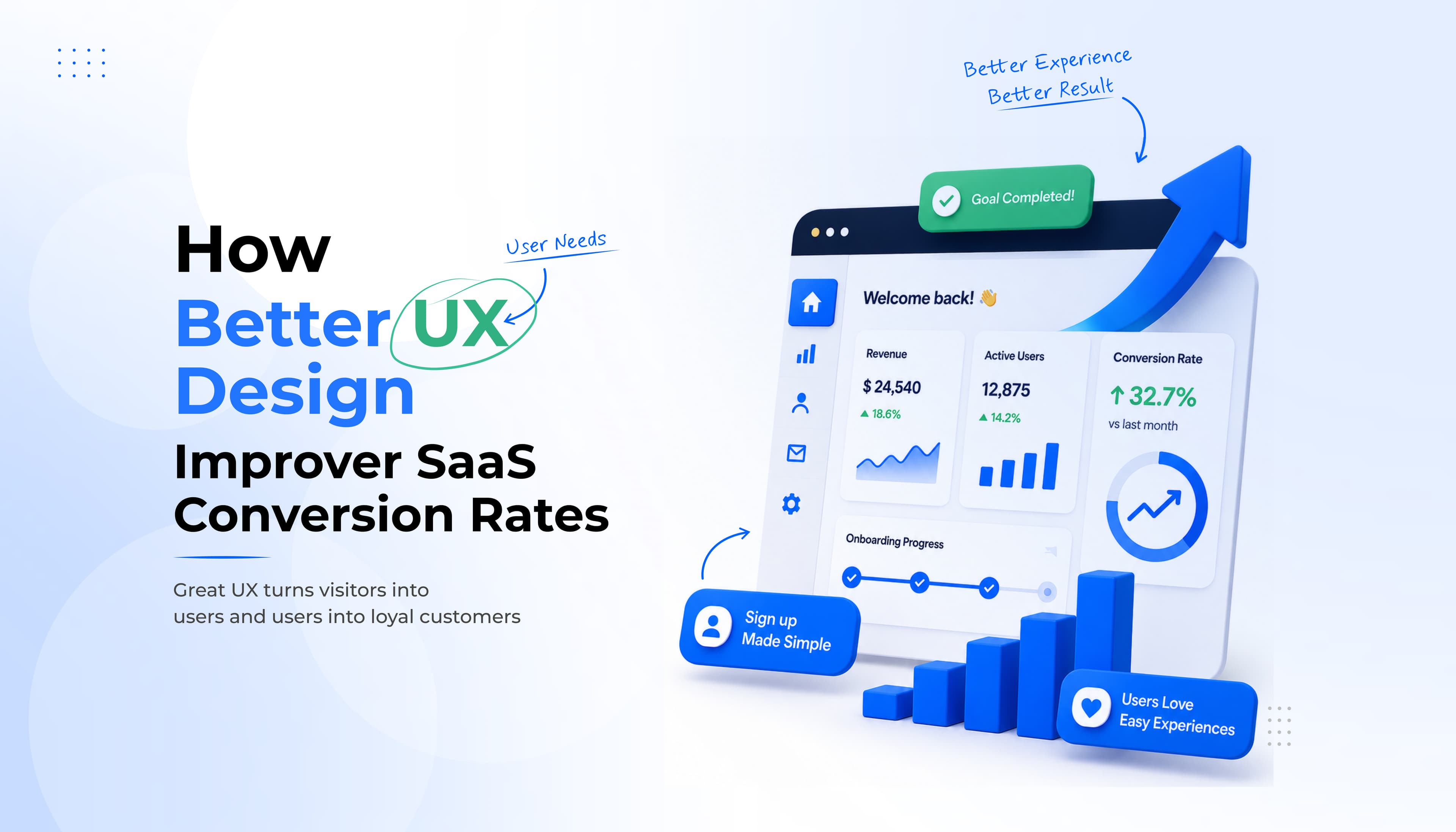
Most SaaS teams assume conversion problems start with pricing.
If trial-to-paid conversions are low, pricing must be wrong. If user activation is weak, marketing must be attracting the wrong audience. If retention is declining, competitors must be offering more value. But in many SaaS UX audits we've conducted, the root cause appears much earlier in the customer journey.
Users don't abandon products because they dislike the idea. They leave because the experience makes it difficult to realize the value. A confusing onboarding flow. An overwhelming interface. A frustrating signup process. A poorly timed upgrade prompt.
Individually, these issues may seem minor. Together, they create friction that slows activation, reduces feature adoption, and ultimately impacts revenue growth.
For SaaS businesses operating under a Product-Led Growth (PLG) model, user experience (UX)is no longer just a design consideration. It directly influences customer acquisition costs, activation rates, retention, expansion revenue, and customer lifetime value. The strongest-performing SaaS products are rarely the ones with the most features. They're the ones that make value easy to discover.
In this article, we'll examine five common UX friction points we frequently identify during SaaS UX audits, how they affect conversion performance, and the design strategies used to solve them.
User experience influences every stage of the customer journey.
From the first landing page visit to onboarding, activation, feature adoption, subscription upgrades, and long-term retention, every interaction either helps users move forward or introduces friction. When friction increases:
This is why leading SaaS companies increasingly view UX as a growth function rather than a design function. A well-designed product doesn't just look better. It converts better.
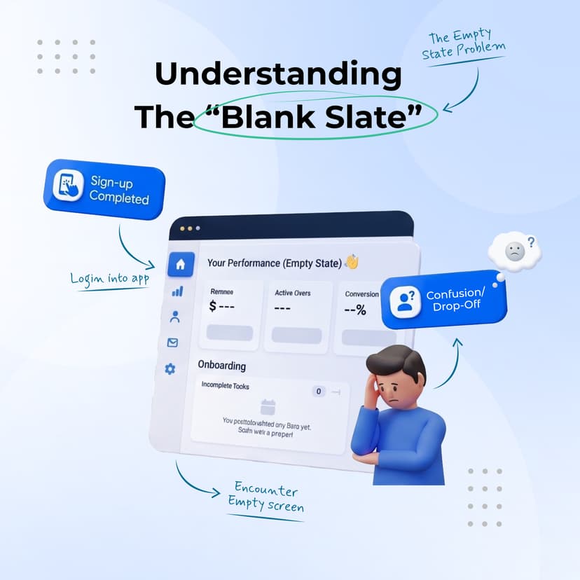
One of the most common issues we encounter during UX audits is the completely empty dashboard experience. A user signs up, logs in, and is immediately presented with a blank workspace. No guidance. No sample content. No indication of what success looks like. While product teams often view this as simplicity, users frequently experience uncertainty.
When users don't know what to do next, onboarding momentum disappears.
Poor empty state UX often creates uncertainty, causing users to abandon onboarding before experiencing the product's value. This can lead to slower user activation, reduced feature exploration, lower product adoption, and weaker trial-to-paid conversion rates.
Leading SaaS products use empty states to guide users instead of leaving them with a blank screen. Interactive onboarding, sample data, onboarding checklists, progress indicators, and guided empty states help users understand the next step and reach value faster.
Improving empty state design reduces friction and shortens Time to Value (TTV). As users gain confidence more quickly, businesses typically see higher user activation, stronger feature adoption, better trial engagement, and improved conversion performance.
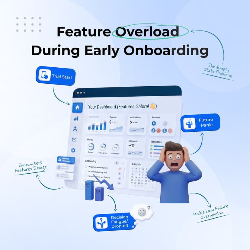
Many SaaS products attempt to showcase everything immediately after signup.
Users encounter:
all within the first session. The result is often cognitive overload. Behavioral design principles such as Hick's Law show that users take longer to make decisions when faced with too many choices.
Feature overload can overwhelm new users, making it difficult to identify the fastest path to value. This often leads to lower onboarding completion, delayed activation, reduced feature adoption, and increased user abandonment.
Successful SaaS onboarding focuses on outcomes instead of showcasing every feature. Techniques like progressive disclosure, milestone-based onboarding, simplified navigation, guided workflows, and personalized user journeys help users build confidence step by step.
Reducing complexity creates a smoother onboarding experience and helps users achieve value faster. The result is higher activation rates, stronger user engagement, improved product adoption, and better customer retention.
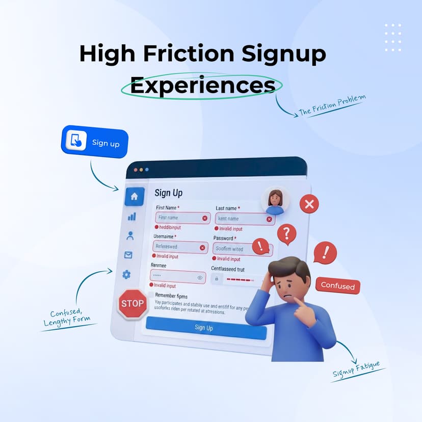
Signup is often the highest-intent moment in the customer journey. Unfortunately, many SaaS products create unnecessary barriers through:
Every additional step introduces an opportunity for abandonment.
A complicated signup experience creates unnecessary friction at the very first touchpoint. Lengthy forms and complex authentication often result in lower visitor-to-signup conversion, increased drop-off rates, fewer trial starts, and reduced user activation.
Modern UX design focuses on making account creation fast and effortless. Features such as social authentication, magic-link login, passkey authentication, minimal signup fields, progressive profiling, and inline validation help users get started with minimal friction.
Reducing signup friction creates a smoother onboarding journey and encourages more users to complete registration. Businesses typically see higher signup completion rates, increased trial participation, faster onboarding, and improved conversion funnel performance.

One of the most persistent misconceptions in SaaS is that mobile experiences don't matter because users primarily work on desktop devices. The reality is different.
Decision-makers frequently evaluate products on mobile devices before committing to demos, trials, or purchases.
They use mobile to:
A poor mobile user experience can drive potential customers away before they engage with your product. Slow loading times, difficult navigation, and unresponsive interfaces often lead to higher bounce rates, lower signup conversions, reduced trust, and increased drop-off during the evaluation stage.
A successful mobile-first UX strategy ensures users have a seamless experience across every device. Responsive design systems, mobile-friendly navigation, accessible touch targets, fast-loading pages, and optimized pricing pages make it easier for users to explore and convert.
Improving mobile usability helps create a consistent experience that encourages users to stay engaged. Businesses typically benefit from higher visitor engagement, better lead conversion, stronger customer perception, and improved conversion rates across devices.
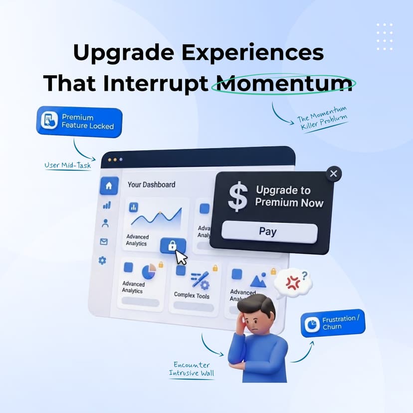
Many SaaS products attempt to drive upgrades by interrupting users mid-task. A user clicks a feature and immediately encounters a full-screen upgrade request. From a business perspective, the intention is understandable. From a user perspective, it feels like an obstacle.
Poorly timed upgrade prompts can interrupt the user experience instead of enhancing it. When users are asked to upgrade before experiencing value, it often leads to frustration, reduced engagement, lower retention, and a higher risk of churn.
Effective upgrade experiences are built around user value, not sales pressure. Usage-based prompts, feature previews, contextual recommendations, transparent plan comparisons, and outcome-focused messaging help users understand why upgrading benefits them.
When upgrade prompts align with user goals and appear at the right moment, businesses typically see higher upgrade rates, better customer retention, increased customer satisfaction, and stronger expansion revenue.
The challenge with UX friction is that it rarely appears as a single issue. Most conversion problems stem from multiple small obstacles across the customer journey.
That's why UX audits remain one of the most valuable growth initiatives available to SaaS teams. A comprehensive UX audit combines:
The goal isn't simply to identify design issues. The goal is to uncover barriers preventing users from reaching value.
The most successful SaaS products don't win because they have more features. They win because users can understand them faster. Adopt them faster. And achieve meaningful outcomes faster.
Every improvement to onboarding, navigation, usability, accessibility, and product flow contributes to a larger objective: reducing friction between users and value. For SaaS founders, product leaders, and growth teams, UX is no longer a cosmetic investment. It's a measurable growth lever.
Because when users find value faster, conversion tends to follow. And that's exactly where strategic UX design creates its greatest impact.
Yes. Better UX reduces friction throughout the customer journey, helping users reach activation faster, adopt key features more easily, and progress toward paid plans with greater confidence.
Poor onboarding experiences are among the most common causes of low activation and conversion rates. When users struggle to understand how to achieve value, abandonment increases significantly.
A UX audit is a structured evaluation of a product's user experience. It identifies usability issues, conversion barriers, friction points, and opportunities to improve activation, retention, and overall customer experience.
Most growing SaaS companies benefit from conducting UX audits at least annually or after major product releases, onboarding redesigns, or significant changes to user workflows.
“ Looking for a creative partner? Let’s connect and bring your ideas to life! ”